- 1,975
- 1,027
- Joined
- Nov 16, 2013
Yeah I sold my sport blue 3s was terrible plastic indeed
Follow along with the video below to see how to install our site as a web app on your home screen.

Note: this_feature_currently_requires_accessing_site_using_safari
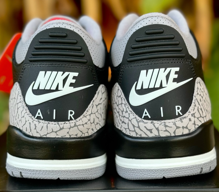
That OG shape plz Nike! I know they not ggonna do it though.We posted a lot about it earlier in the thread
With a user named X-Alt
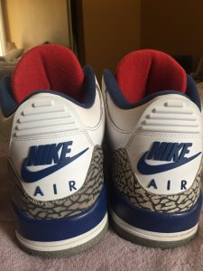
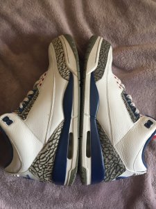
If we go by the 1988 shape
You'll see it's more of a sharp muffled nose shape
And with the most recent true blue
You see the shape come up
Also the discussion of thickness of the print
If you notice the OG had a thinner print
Vs the recent having a thicker print
Black V's seem to be sitting, I hope this trend continues
Cuz people would rather have NMD's and Yeezy's. Not me tho I'm loving this. This is my first year really buying alot of Jordans and I'm getting everything I want [emoji]9786[/emoji][emoji]9786[/emoji]
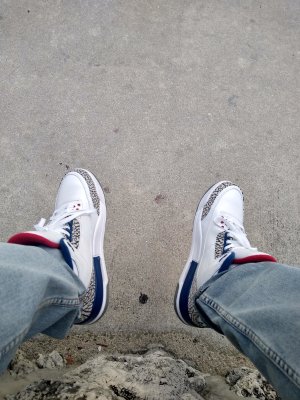
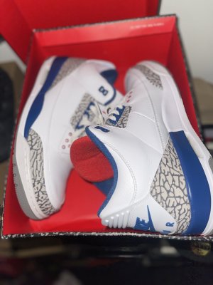
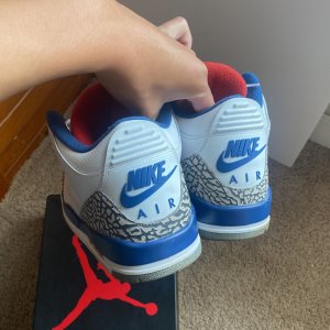
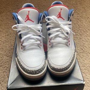
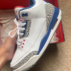
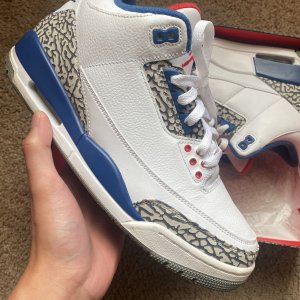
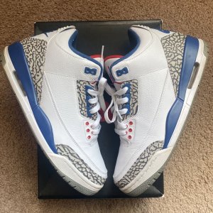
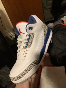
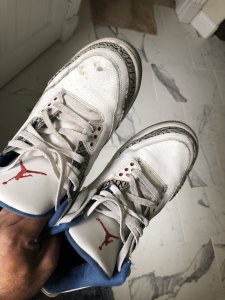
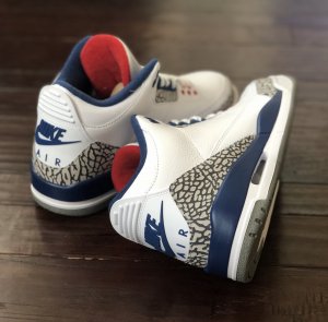
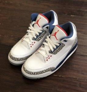
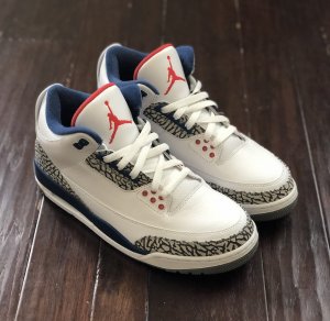
I've always liked the blue tongue liner more than the red on this sneaker.
My thoughts as well. I've never owned a pair other than the 2011s, but I always liked the look of the red tongue.I like the red tongue; this show has too much blue and the red balances it out
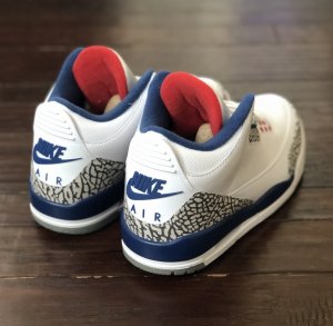
Very good point. Never looked at them side by side like that.View media item 2114183View media item 2114186All blue makes the red jumpman and eyelets stand out more imo cleaner look
Very good point. Never looked at them side by side like that.
Very good point. Never looked at them side by side like that.
View media item 2114183View media item 2114186All blue makes the red jumpman and eyelets stand out more imo cleaner look
yea same here im trying for 2 pair. Its my atf of the jordan 3'sI would agree....but cant pass up the look of rhe original.....must add for my collection

The thing is if they were going to use the red lining like the OG then they should've rolled the leather edges at the tip/top of the tongue, like the OG. If that makes sense. Red lining looks kinda awkward as is IMO. The fact is they haven't rolled the edges of the tongue since the OG. I'm sure I'll get used to it (the visible red lining) though.
i like the red but id be happy with eitherView media item 2114183View media item 2114186All blue makes the red jumpman and eyelets stand out more imo cleaner look
ThisThe thing is if they were going to use the red lining like the OG then they should've rolled the leather edges at the tip/top of the tongue, like the OG. If that makes sense. Red lining looks kinda awkward as is IMO. The fact is they haven't rolled the edges of the tongue since the OG. I'm sure I'll get used to it (the visible red lining) though.
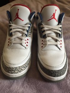
personally for me I get the whole og red tongue but the BC sock liner is grey along with the front of the tongue. WC has the white sockliner along with the tongue. just the colorblocking in the sockliner looks weird red with blue. The white and grey are more neutral colors. Looks like a frankenstein mash up JB ran out of TB tongues and used the WC leftovers.I don't get this red tongue hate...
BC - red tongue
WC - red tongue
OG TB - red tongue
From 01,09,11 had blue tongue.
Having owned the 01s and 11s, I'm glad they went back to the red.
The only thing questionable is that shade of blue...

I feel you...what can you do?[emoji]128532[/emoji]I'm paying $190-220 on Jordans, $200-250 on Foams, $200 on Lebrons, $160-250 on Kobes, and $1000 on Yeezys. I really don't care anymore.