Air Jordan IV “Black/Cement” - May 4th 2019

Toe box looks good to me...
Back tag seems to be centered by the swoosh and not by the "nike" but it's not bad at all.
Would have preferred the grey trim on the nubuck to break up the upper...But that's fine too. Will definitely get a second pair on May 4

Verdict, these MF are ill
20190418_134054.jpg

20190418_140038.jpg

What size are these? Around a 9/9.5 or something? I imagine the toe box would look better on smaller sized pairs?

Some of the on-foot pics we've seen the damn toe looks like a platypus lol.
 
Do you guys think the pull tabs will differ enough to justify me asking an employee to pull out 2 or 3 pairs to compare? And NO, that's not doing too much, it's not too much to ask employees to put in a tiny bit of effort.
 
I’m not sure. I’ve worn these about a good ten times. They seem to be holding up.

I’ve had mine “restored/cleaned” & they are still are yellowed as hell. You got a good pair


Do you guys think the pull tabs will differ enough to justify me asking an employee to pull out 2 or 3 pairs to compare? And NO, that's not doing too much, it's not too much to ask employees to put in a tiny bit of effort.

I agree but that doesn’t mean they won’t give you bs about it... had to sit & have a lame bnf with a ftl employee cuz he brought me a dinged up og1 box & I was picking up 20-30 mins before cutoff. Fam swapped my box tho I wasn’t gonna apple pay until he did.
 
  • Like
Reactions: ARK
Nike is the same size actually. The difference is the relationship between AIR and the Nike & Swoosh. It seems to be off by 1/8”. I’m a graphic designer with 20 years experience so I find it fascinating why the logo looks off and what / why it was changed on this release.

5C859933-B507-4809-A441-7C7F63A0E151.jpeg
9B5CB318-D832-4AA3-AFA6-216652F974F3.jpeg

You can clearly see the E is thicker.
 
ARK ARK , tonytobacco tonytobacco
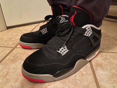
It also appears from the pics that the actual size of the letters used for AIR are larger than on the WCs. Illusion or real?
nah, the culprit is on the word nike itself. I noticed the I in air was lined up to the bottom vertical seam on the wc4 and off to right by just a hair on the bc4 but that could easily be QC. 'NIKE' is way more left to the nubbed pull tab on the bc4.

Im pretty sure what happened was the width of the tab got skinnier while the lettering stayed the same size. So instead of cutting some of the swoosh's tail off, like it should be in the first place, they just shifted NIKE and the swoosh to the left so both ends fit while AIR stayed planted. Its not a lot of distance in the shift but millimeters are miles in this scenario.

perhaps what needs to be measured is how much length remains on the tail of the swoosh in relation to the R underneath
 
29EA70C2-9302-49F8-96A9-885E5A3FD681.png
Nike is the same size actually. The difference is the relationship between AIR and the Nike & Swoosh. It seems to be off by 1/8”. I’m a graphic designer with 20 years experience so I find it fascinating why the logo looks off and what / why it was changed on this release.

5C859933-B507-4809-A441-7C7F63A0E151.jpeg
9B5CB318-D832-4AA3-AFA6-216652F974F3.jpeg
This is what we doing now?
 
Never forget the whole report on “speckle density”

Only the real NT knows that day lmao

I guess that could be measure by taking a inch square sample and counting the speckles then averaging out the findings.

:rofl:
 
Someone whip out a pair of OGs throw a tape measure up to them thangs and settling this NA alignment

It amazes me how OG’s be full of flaws and we over look em.
 
Someone whip out a pair of OGs throw a tape measure up to them thangs and settling this NA alignment

It amazes me how OG’s be full of flaws and we over look em.
OGs are fine, you dont need a ruler

flaws are one thing, this is essentially a typo
they sent an entire run of bred 1s to the outlets over stuff like this
 
Back
Top Bottom