- Jul 1, 2008
- 14,901
- 20,204
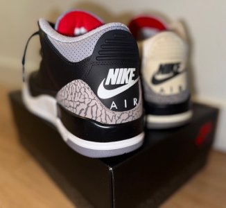
Literally that's one of the first things mentioned when people talk about the new (Post 2020) shape
Follow along with the video below to see how to install our site as a web app on your home screen.
Note: This feature may not be available in some browsers.
Calling kids dumb because they don't have similar preferences of a shoe's shape as you is kinda wild... I keep telling y'all that Niketalk is a site for enthusiasts and the way we view things are very niche compared to the general public. 99% of consumers don't care about shape, EP, height, leather etc .. all they care about is if the shoe/cw looks good to them and that's ok. Alot of consumers like the bold & high EP on the 3s, a lot of consumers like lower patent leather on the back, alot of consumers liked the 23 on the back of the 9s... Let's not turn into elitists fellas.

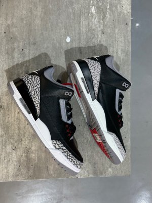
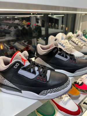
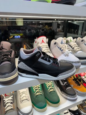
The color of the 2024s is trash... the toebox is the only bad part about the 2018s..the cement gray is not hitting, the leather looks trash. The shape is cool but don't tell me they look like OGs or even mid 2000s retros cuz they don't have the same hue, therefore it's another trash retro. JB could have made the elephant print exactly like the 2018s and then they'd be perfect but in this case it's not...This is why lots of folks in the IG comments are saying they like the 2018's better.
They just don't know any better.
They're young and grew up during the Gentry and post-Gentry era of garbage retros.
It's what they grew up on, but can't blame them.
Shout out @forest hills as being one of the few youngins that get it.
Even my homeboy whose been buying Jordan's since 1999 don't really care about Toeboxgate like we do.. I had a 20 min conversation on why the 2018 was trash... it took 20 minutes of explanation and 17 pics for him to notice the difference... even he said the elephant print on the 2024s look crazy....Calling kids dumb because they don't have similar preferences of a shoe's shape as you is kinda wild... I keep telling y'all that Niketalk is a site for enthusiasts and the way we view things are very niche compared to the general public. 99% of consumers don't care about shape, EP, height, leather etc .. all they care about is if the shoe/cw looks good to them and that's ok. Alot of consumers like the bold & high EP on the 3s, a lot of consumers like lower patent leather on the back, alot of consumers liked the 23 on the back of the 9s... Let's not turn into elitists fellas.

The slant stops the banana shape when you wear shoes, or limits it. With the bad shape of past releases they curl up and look terrible. That square toe is terrible too and the different EPs make these kind of annoying and frustrating if you buy online since its a crap shoot at that point.Them 88 joints got that goku slant going on...idk why ppl so crazy about wanting that
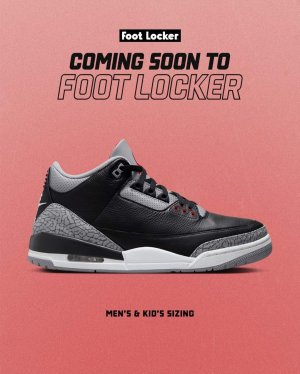
Already isThis thread will be hilarious come November.
 toe but I'd much rather have the 2024 look than tht elf looking 1988 that was posted. Og or not.
The color of the 2024s is trash... the toebox is the only bad part about the 2018s..the cement gray is not hitting, the leather looks trash. The shape is cool but don't tell me they look like OGs or even mid 2000s retros cuz they don't have the same hue, therefore it's another trash retro. JB could have made the elephant print exactly like the 2018s and then they'd be perfect but in this case it's not...
The 2018s minus the toebox > whatever type of grey the 2024 version has on it

That being said, these still **** all over the 18s. It's not close. At all.
I don't even know how this is a real discussion.
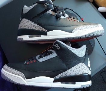
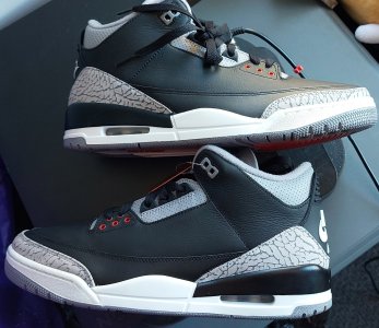
 2018's had that Walmart Shaq EP.
 niketalk.com
I get it trust me I do. I just had this discussion in another thread a few days ago. But what we and when I say we,I mean my generation which is the end of generations X and the start of the millennials are gonna have to realize is we are not Nikes target demographic anymore. We are getting older and more responsible with our spending. Collectors like us are a minority. The company is marketing to 18-30 year olds now. Our opinion is gonna matter less and less. Perfect example is the ‘85 high. They make a minuscule amount of them because the truth is nobody cares about them but us. I’m glad they are dropping a lot of OG favorites the next 12 months because it’s time for me to give it up. After this last run I should be set well into my 50’s. I’m gonna let the kids have it. I can already see the company is going in a direction that’s not going to be OG friendly.
Appreciate the love. I'm telling ya man. The day JB starts trying to please that side of the sneaker community, we are going to end up back in the dark ages of Jordan Brand. For example I've seen so many people around my age or older even, complaining online about the higher PL cut on 11s and hating the glitter accents on the OG 8s (Aquas in particular). And I know preferences are thing but I just shake my head seeing that nonsense.
The goal of these retro releases should be to faithfully recreate the original look that Moore and Kilgore intended for the Jordan 1 and 2, and what Tinker intended for the 3 thru 15. These shoes that we all love are not only just that, but they are art. When you sit a pristine pair of OGs next to a modern retro, the difference is night and day. For example: 1991 Black Infrared 6s. The higher tongue, the white/grey cut lines that pop out at you and break up the monotony of the black Durabuck, the leather-like contrast heel, I could go on.

Seeing a pristine pair makes my eyes widen. That is how they were meant to look. That is how modern iterations should look. The fact that a lot of the younger crowd would look at those above and not care nor see anything special about them is wild to me. Same goes for these 3s. The fact that dudes can look at the OGs in all their sleek,well proportioned, aerodynamic glory and then still say that the the clunky *** 2018 release or even that this current one looks better, is crazy.
Calling kids dumb because they don't have similar preferences of a shoe's shape as you is kinda wild... I keep telling y'all that Niketalk is a site for enthusiasts and the way we view things are very niche compared to the general public. 99% of consumers don't care about shape, EP, height, leather etc .. all they care about is if the shoe/cw looks good to them and that's ok. Alot of consumers like the bold & high EP on the 3s, a lot of consumers like lower patent leather on the back, alot of consumers liked the 23 on the back of the 9s... Let's not turn into elitists fellas.
The color of the 2024s is trash... the toebox is the only bad part about the 2018s..the cement gray is not hitting, the leather looks trash. The shape is cool but don't tell me they look like OGs or even mid 2000s retros cuz they don't have the same hue, therefore it's another trash retro. JB could have made the elephant print exactly like the 2018s and then they'd be perfect but in this case it's not...
The 2018s minus the toebox > whatever type of grey the 2024 version has on it
Even my homeboy whose been buying Jordan's since 1999 don't really care about Toeboxgate like we do.. I had a 20 min conversation on why the 2018 was trash... it took 20 minutes of explanation and 17 pics for him to notice the difference... even he said the elephant print on the 2024s look crazy....


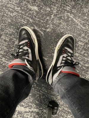
Now you can tell the difference?
Yeah cause those above are fufuReal pairs have been posted and y'all still posting reps for some reason.