Navigation
Install the app
How to install the app on iOS
Follow along with the video below to see how to install our site as a web app on your home screen.
Note: This feature may not be available in some browsers.
More options
You are using an out of date browser. It may not display this or other websites correctly.
You should upgrade or use an alternative browser.
You should upgrade or use an alternative browser.
Post Your New Eras*59-Fiftys*etc... VOL. INFINITY NOW W/ Henz0/Thunderchunk/Icy's FAQ ON PG.1
- Thread in 'Sneaker Showcase' Thread starter Started by orfiyus,
- Start date
- Apr 14, 2003
- 11,375
- 13,670
I can’t mess with any of those drops
This was sitting on City Jeans in my size so i had to grab it as I’ve wanted this logo/patch combo. Used some points on a CC and it ended up costing me $20

 cityjeans.com
They’ve got a few more of these camel 2 tones up as well mostly random sizes however the dbacks has 1/8-3/4 available.
 cityjeans.com
Another one added to the stampede

This was sitting on City Jeans in my size so i had to grab it as I’ve wanted this logo/patch combo. Used some points on a CC and it ended up costing me $20


New Era San Diego Padres Tan Fitted Cap
We at City Jeans pride ourselves on being one of the best brand name retailers in footwear and apparel. We carry exclusive items from top companies such as Nike, UGG, Adidas, Timberland, and Jordan. We have 9 stores (and growing) in The Bronx and Queens area.
 cityjeans.com
They’ve got a few more of these camel 2 tones up as well mostly random sizes however the dbacks has 1/8-3/4 available.
Search results for: 'New era tan' - City Jeans
Another one added to the stampede

- May 10, 2009
- 4,557
- 6,634
Friday
Thursday
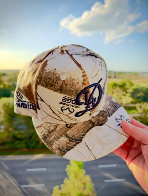
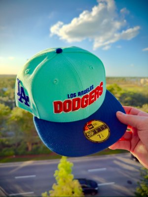
Need the dodgers never ordered from
Them though. Is it a hassle?
- Aug 4, 2006
- 10,297
- 5,069
I told myself I was gonna cut down on shoes and it seems I've substituted one addiction for another. I'm gonna go broke trying to catch up with y'all

I've never copped from them before. I wanted to buy a hat from them once but it was sold out in my sizeNeed the dodgers never ordered from
Them though. Is it a hassle?
rbk93
Supporter
- Jun 29, 2016
- 14,200
- 13,509
Got off eBay for around $30.


- May 24, 2006
- 5,881
- 1,628
Capsule is a pain in the *** to hit. You basically have to monitor their IG for drops since that’s where they put up the password per drop.Need the dodgers never ordered from
Them though. Is it a hassle?
They have the best shipping/packing in the game tho.
- Feb 4, 2022
- 1,076
- 2,077
I can’t mess with any of those drops
This was sitting on City Jeans in my size so i had to grab it as I’ve wanted this logo/patch combo. Used some points on a CC and it ended up costing me $20

New Era San Diego Padres Tan Fitted Cap
We at City Jeans pride ourselves on being one of the best brand name retailers in footwear and apparel. We carry exclusive items from top companies such as Nike, UGG, Adidas, Timberland, and Jordan. We have 9 stores (and growing) in The Bronx and Queens area.cityjeans.com
They’ve got a few more of these camel 2 tones up as well mostly random sizes however the dbacks has 1/8-3/4 available.
Search results for: 'New era tan' - City Jeans
cityjeans.com
Another one added to the stampede

I can't do colored UVs that aren't black, grey or green.
- Feb 4, 2022
- 1,076
- 2,077
Another counterfeit. Noticed he turned the comments off for this post.
Another counterfeit. Noticed he turned the comments off for this post.
Edit: nvm I see
Last edited:
- Sep 28, 2004
- 13,924
- 5,900
Honestly that orange crown just looks a tad too detailed in the diagonal wool/poly material. It’s the same detail I see out of the fake on fields I see.
It doesn’t help the Buffalo logo looks like trash.
The crown doesn’t look deep enough. It actually looks better lol.
The piping being upside down or whatever is okay. That’s not a tell tell sign. What is is the contrast stitching in various spots.
It doesn’t help the Buffalo logo looks like trash.
The crown doesn’t look deep enough. It actually looks better lol.
The piping being upside down or whatever is okay. That’s not a tell tell sign. What is is the contrast stitching in various spots.
- Sep 18, 2013
- 1,479
- 3,303
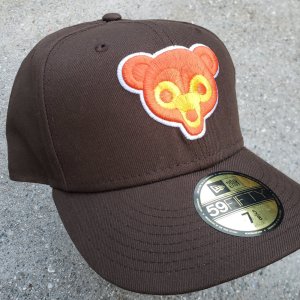
Topperz Kitty came in today. One of my favourite pickups, made in China too. The orange is very fluorescent


- Dec 4, 2003
- 1,668
- 1,517
Another counterfeit. Noticed he turned the comments off for this post.
- Apr 14, 2003
- 11,375
- 13,670
djlunchbox You think they used your sidepatch file? Looks about the same size.
I don’t think so. They probably had whoever made the hat make the file for them. They ordered these way before i made my patch i believe.
Nice off-white mail call from Lids and HC


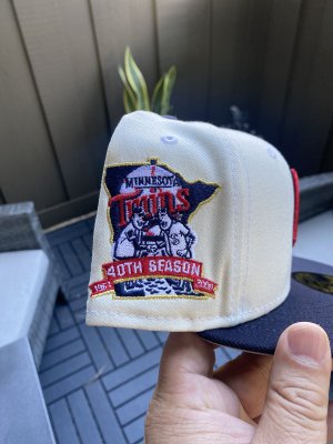

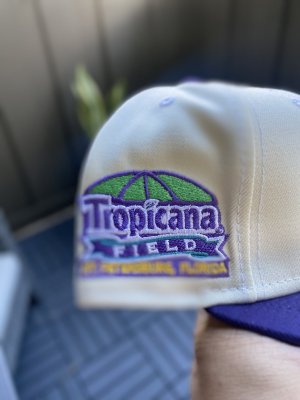

- Apr 14, 2003
- 11,375
- 13,670
Yeah i wasn’t feeling that pack but the Twins is fire. Going for that only lol
- May 24, 2006
- 5,881
- 1,628
Wish this had black sweatband because damn this is clean!
Didn’t even realize


- May 24, 2006
- 5,881
- 1,628
Just hit on this as well, 

- Aug 4, 2006
- 10,297
- 5,069
damn those two caps by ty that dropped today are fire, sad i missed em 

- Sep 28, 2004
- 13,924
- 5,900
The orange bisons is also missing the milb tag inside the sweatband. I’ve seen that tagging on a variety of legit bison caps
 djlunchbox
I was this close to going after that off white twins M cap. I’m a sucker for that logo. That would be one great application to those sweat inserts. light colored crowns just show so much. That’s why I maybe own 2-3 only and the rest seem to be dark navy dominant.
Todays wear
Truly the only correct side patch for on field styles

It’s a made in China wool custom from many years back. I believe the team wore both dark navy and light navy around this time. They’ve made customs of both over the years. This ones a light navy
I’m surprised they haven’t brought back the ws patches onto customs in basic team colors in more abundance. This cap for example or a wahoo 2016. It’s sort of always the same set of teams and caps. Maybe it’s within the cooperstown rule book? Then again, most remakes use the jersey sleeve logo and not the hat logo (which differed for many many years). So who am I kidding. Let the barrage of colors happen. I don’t think most want or have the stamina to get them closer to og spec (especially if they don’t sell out).
Todays wear
Truly the only correct side patch for on field styles

It’s a made in China wool custom from many years back. I believe the team wore both dark navy and light navy around this time. They’ve made customs of both over the years. This ones a light navy
I’m surprised they haven’t brought back the ws patches onto customs in basic team colors in more abundance. This cap for example or a wahoo 2016. It’s sort of always the same set of teams and caps. Maybe it’s within the cooperstown rule book? Then again, most remakes use the jersey sleeve logo and not the hat logo (which differed for many many years). So who am I kidding. Let the barrage of colors happen. I don’t think most want or have the stamina to get them closer to og spec (especially if they don’t sell out).


