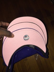
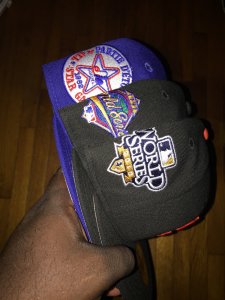
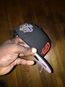
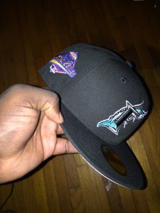
Also, it looks like fanatics had the thicker A hat for awhile too
This Oakland Athletics World Series Wool 59FIFTY hat from New Era is a good ol' throwback for anyone missing that unforgettable moment from back in the day.

www.fanatics.com
these older battle of the bay caps were done rigbt
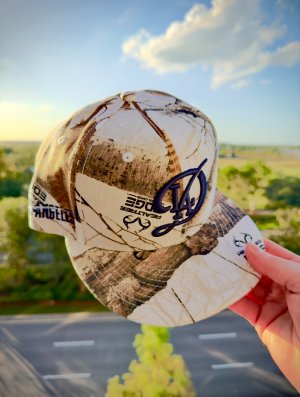
And even this random Custom cap from google appears correct on all fronts.
It appears some of the latest to release have been using the thicker A. Sometimes you get a purchaser or shop that doesn’t care about details.
This one has an oversized Logo , thicker A, But features a pink UV. Instant sellout.
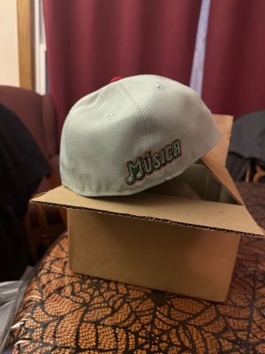
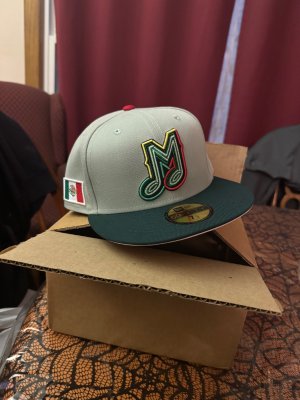
I own a few twins caps where they perfected the M logo on size and dimensions. Years later, they make it smaller in size and it’s just not the same.
4ucap and sportsworld165 both have the ugly A
hatheaven went super accurate and even got the green under in.
Celebrate the 1989 Oakland Athletics and their iconic Battle of the Bay victory in the World Series over the San Francisco Giants. Staying true to throwback specs, the side patch is left-sided and rear logo is omitted. As if that weren’t enough, the Kelly Green undervisor completes the classic...

hatheaven.com
The only thing exclusive about these caps is their very first release. Beyond that, they enter a NEW ERA database of accepted logos and designs, which anyone can bite off of.
This latest wave of bad thicker As is just the sign of the times on a overseas quality front too. Mostly it’s the websites who don’t care too much about detail and go with a design already in the database. So if it’s wrong for ecapcity, it’s wrong for the others. HC over the years has tried to make it all accurate, a lot better than the others.
tldr. Sometimes inaccurate logos make it into the wild and it just spreads like a wildfire. This thicker A is just one example One website becomes 6-7 almost overnight and people don’t know right or wrong,or even care. Sorry for the rant lol.

 this is pretty dope. Dunno if id rock it personally


