- 47,244
- 96,774
- Joined
- Mar 19, 2013

Follow along with the video below to see how to install our site as a web app on your home screen.

Note: this_feature_currently_requires_accessing_site_using_safari


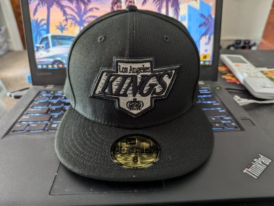
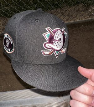
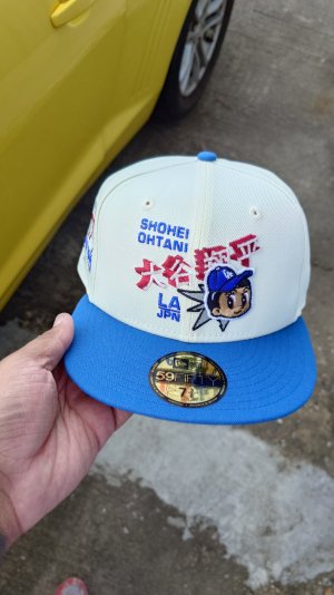
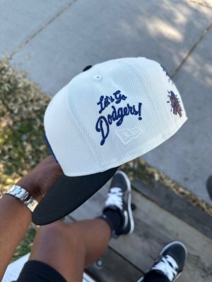
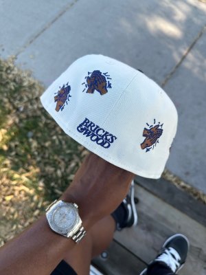
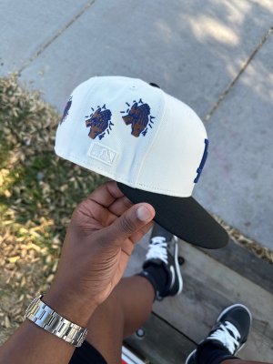
Hat heaven restock
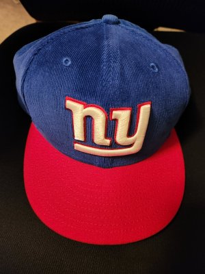
Lots of mets fans exclaimed at their switch from black. They all call it BFBS (black for black sake) but I don’t mind that era at all.
the black mets era has had a slight return.


I’ve de flagged a half dozen caps over the years. Just be patient. It may take up to an hour. The scarring is absolutely minimal if you take your time.

The second one was a tad more lazy as you can vaguely see the outline and some wool that got caught in the mix. But it’s beyond worth it.
Mickeys place is the only source who’s continually been great about side flag or no side flag. Other websites are lazy.
The tonal flags are a B to remove. I don’t dare try to do that anymore.
Missed it again
yeah. Uniwatch and sportslogos.net, I occasionally check outSome Mets fans even want the team to wear the black jerseys again as an alternate, meanwhile I'm still remembering how they were the epitome of BFBS and now I feel beyond washed that these are considered throwbacks.
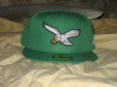
There is something about that black Mets fitted with blue bill and grey underbrim that they wore during that period that looks
You read Uni Watch too?

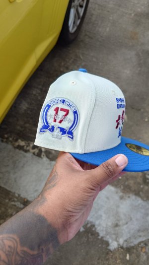
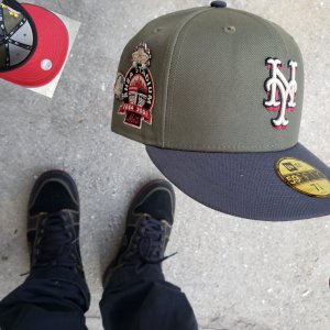
And that Pittsburghecapcity restocking that Mets you wanted tomorrow night. Keep an eye out
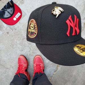
In my mind, if it doesnt have the flag it's not even a cap

Where?Grey under
TAASS in GermanyWhere?


Got it from the locker room at Downeybro... info on this one? Sheesh