- Oct 6, 2016
- 10,629
- 23,576


Last edited:
Follow along with the video below to see how to install our site as a web app on your home screen.
Note: This feature may not be available in some browsers.


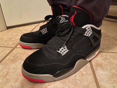
 No offense to anyone but come on. IV's haven't been right since like 2000 minus some one offs here and there.
Stop it.from a design perspective, that's actually correct center placement for the 2 different elements that make up the nike/swoosh + air logo. the text nike isn't centered with the swoosh... so it makes sense to center the air text with the swoosh
Correct if Im wrong. But wasnt the 3 and 4 supposed to be a three quarter mid? I know people think these recent 4s are too low but its seems to be the perfect in between from a Jordan 1 compared to a Jordan 2 low from the 80s. The highs came back with the 5 through 9. Then the mids came with the 10 and 11.
Is it possible they made the 99 too high?
has anyone done comparisons to the 2012 pairs? I'm still wearing mine and have another DS pair. But not sure if selling the DS and buying the 2019 pair is worth it. I dont really care to have NA branding but care more about shape/material
has anyone done comparisons to the 2012 pairs? I'm still wearing mine and have another DS pair. But not sure if selling the DS and buying the 2019 pair is worth it. I dont really care to have NA branding but care more about shape/material
Everyone complaining about the height. Please pass and find you a nice mid top shoe that’ll protect your ankles perfectly
People almost forget that they can choose not to purchase these
Believe me I was not trying to justify anything more than just thinking out loud. I def would choose the 99 shape over anything else with out question.And here comes all of the justification...
He's right though.Stop it.
So you want the heels to feature what appears to be an incorrectly offset "AIR" beneath the Nike and swoosh? OK. Strange, then, that the majority of Nike Air heel logos for the past four decades have not looked like that, regardless of what is technically correct according to the graphic-design textbook.He's right though.

So you want the heels to feature what appears to be an incorrectly offset "AIR" beneath the Nike and swoosh? OK. Strange, then, that the majority of Nike Air heel logos for the past four decades have not looked like that, regardless of what is technically correct according to the graphic-design textbook.
I'm sitting here stabbing myself in the eye with a pen. I was tempted to walk the 30 feet over to my creative director's office and have him write a reply, but I didn't want to bother him.We got kids asking for crooked Nike Air now?
Trying to legitimize it?
Apologies, then. You'll understand my confusion after you agreed with the guy who said it was correct. I think we'll all be happier with it looking right as opposed to looking weird but being "correct."Where did I say I wanted that? Oh. I didn't.
It was just about why the Nike logo looked off center.
Apologies, then. You'll understand my confusion after you agreed with the guy who said it was correct. I think we'll all be happier with it looking right as opposed to looking weird but being "correct."
.