- 1,521
- 4,390
- Joined
- Sep 11, 2017
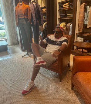
sometimes we need to call it like it is even if it is ralph. That surfer stuff look like old navy.
I’ve always associated old navy (and other brands like that, such as gap) with very basic designs... simple stuff. Plain, or with minimal design work... they don’t take too many chances, as their primary demo isn’t shopping at old navy for stuff that will be polarizing.
The oddness of this surf trip design wouldn’t fit with old navy, gap, etc I don’t think.
it’s definitely ripping off some early 90’s elements, and I’m sure that’s the intention... the neon, fonts, even language used... is all very cheesy early 90’s. I dig it.
I think a lot of folks forget that Ralph would intentionally make gaudy, garish, ridiculous and absurd designs back in the day. It’s been part of the RL dna since the days of making only ties.


![PLWI7027[1].JPG](https://static.niketalk.com/attachments/plwi7027-1-jpg.2781661/ "PLWI7027[1].JPG")


![07-13-08_1514[1].jpg](https://static.niketalk.com/attachments/07-13-08_1514-1-jpg.2782348/ "07-13-08_1514[1].jpg")