- 54
- 21
- Joined
- Apr 22, 2013
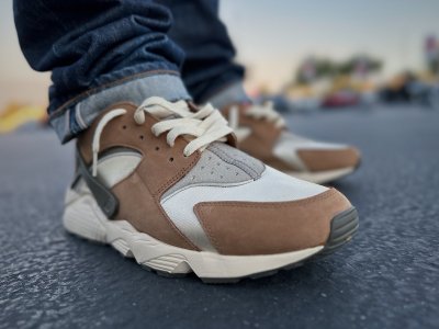
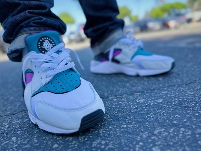
forthcoming Size? X Huarache Light 'Mowabb Releasing End October/ Early November 2014 Keep Look Out on Size official IG & Twitter
Follow along with the video below to see how to install our site as a web app on your home screen.

Note: this_feature_currently_requires_accessing_site_using_safari
I feel the same. Tbh I never cared for them before, but this cw has me converted.Dang those are sweet. My have to try for my first pair of lights


Good looks-
I couldn't tell you the whole story but from what we know the logo was designed by ERIC AVAR and he sketched around 20 different logos before the finally H was chosen
There's possibly some truth to what @MF Gooze said in that the "huarache" or sandal wraps around your foot. The circular parts represent like a universal orbit. After all, this was the future in 1991 and this was a futuristic shoe ahead of it's time. So it had kinda a space element to it. If you look at the original add you'll know what I'm talking about. The objective was to take a primitive invention "huarache" and bring it to the future
Also the mexican huaraches were weaved together simialr to the H logo.
Also subliminally stands for Hatfield. Lol Just kidding.
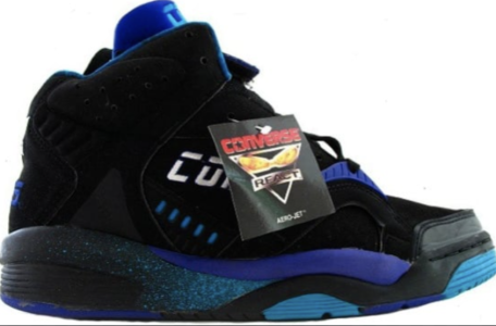
boom- internationals!!
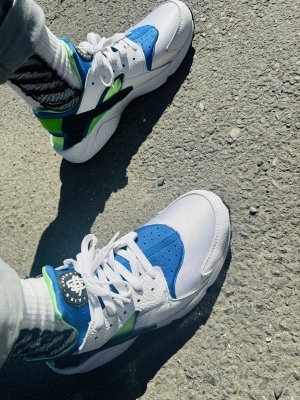
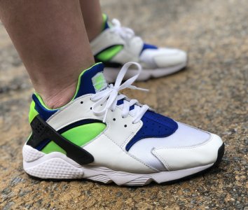
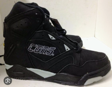
New huarache hybrid
Cant find the C (unless you rotate the logo) or the EGood looks-
I think you'll find that it actually spells out HUARACHE- much like the Toyota symbol spells out toyota.
the whole logo is made up of 'C's' Look harder for the 'E'- it's not straightforward spelling - more 'clever' design trick.Cant find the C (unless you rotate the logo) or the E
Yeah I said if you rotate it you can see a C but if that was the case why didn't they just flip the horizontal section? Is the logo containing all the letters a deliberate design or is it just when people just look at something long enough they start putting stuff together? I'm not saying it's not true I just wanna know if it was actually designed that way.the whole logo is made up of 'C's' Look harder for the 'E'- it's not straightforward spelling - more 'clever' design trick.
TBH -i'm usure- but would lean towards the notion that original logo was drawn up and it was realised that it kind of spelt out huarache- and then there was likely a little tweaking of the design to ensure it did/looked good.Yeah I said if you rotate it you can see a C but if that was the case why didn't they just flip the horizontal section? Is the logo containing all the letters a deliberate design or is it just when people just look at something long enough they start putting stuff together? I'm not saying it's not true I just wanna know if it was actually designed that way.
Need these to drop again
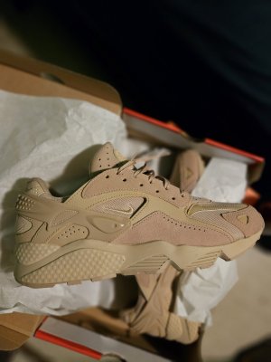
Holla at me if you want someone to post them from UK. I'll post them out to you.NOW I JUST HAVE TO TRACK THESE DOWN WHICH IS NEARLY IMPOSSIBLE SINCE THEYRE ONLY IN EUROPE AND I NEED A 11.5… WHEN I CAN ACTUALLY TRACK A PAIR DOWN… ALL I SEE IS 11'S .. DAMN IT NIKE