- 18,192
- 27,334
- Joined
- Dec 18, 2015
Follow along with the video below to see how to install our site as a web app on your home screen.

Note: this_feature_currently_requires_accessing_site_using_safari


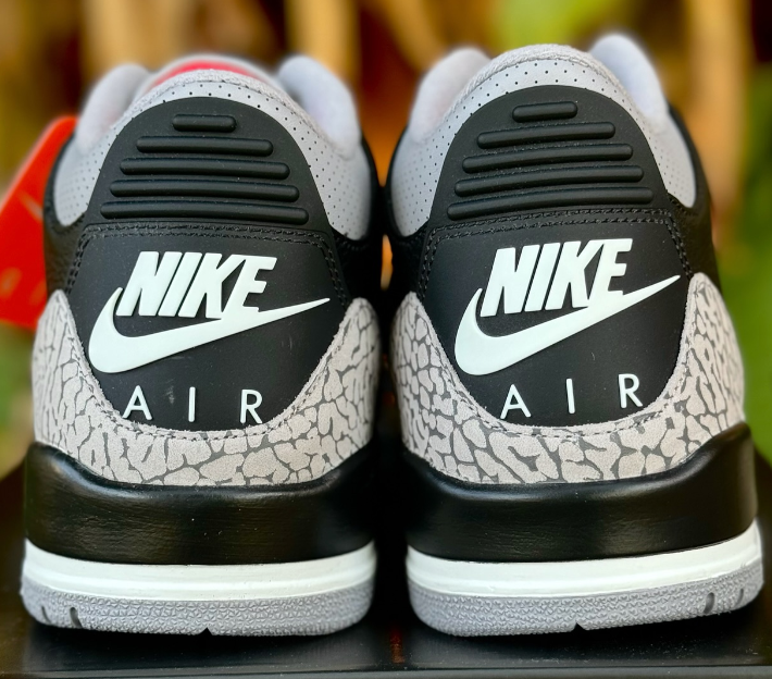
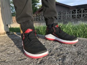
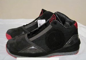
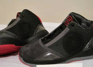
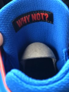
The regular design had the same amount of logos. In fact, the wings logo is smaller on the tongue than the heel. I'd say it's more minimal than that up there lol.
I like the variety and versatility when it comes to branding on this shoe. Definitely my favorite post-23 sig, maybe better than 21 & 23 as well.
My point is they don't need 2 wings logos on the shoe(front and back)and a Jumpman logo on the side. One of each was sufficient; but of course they always have to slap on there more than they need to.

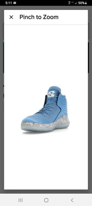
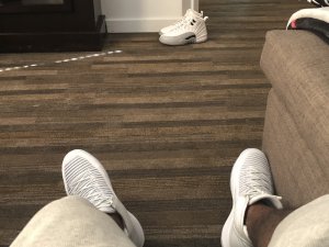
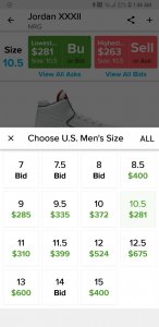
 at the 10.5 price super tempted.
Just showed up on NDC todayWhatever happened to the finale cw? Was it an overseas exclusive?
Just copped thanksJust showed up on NDC today
IMO i've never liked JB's shoes post 14's. They're not performance oriented, rather hinge on the brand itself.
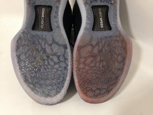
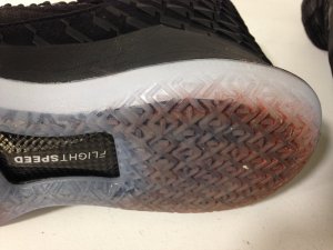
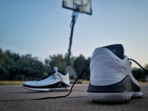
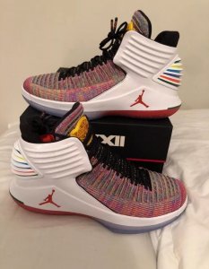
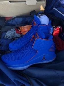
The 32's are bricks.
Rock 'em casually? Sure.
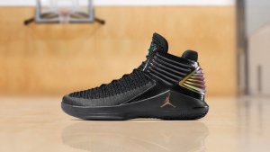
^^^ 28SE is one of the best shoes ever, Jordan or not, and the 29 was magic. The 32has been perfect for me too.