- 2,143
- 6,940
- Joined
- Dec 7, 2015
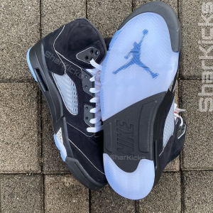
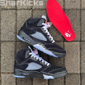
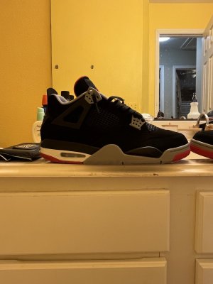
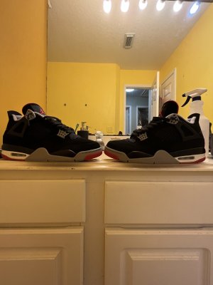
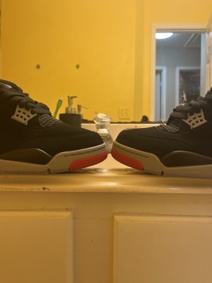
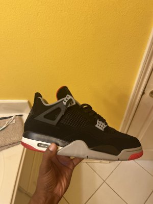
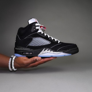
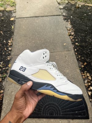
I would like to preface this by saying I respect those of you who are willing to hold firm to their preferences. I'm not knocking anyone but I will say that respectfully, anybody still expecting JB to use a different 3M material on the tongue at this point are tying their shoes together and getting mad when they fall. They've been using it since 2016 and the majority of consumers do not care. It shines well, lasts a while without cracking and chipping, and it does what it's intended to do as a design choice. Jordan Brand has no reason to change it, especially when the majority of consumers don't care. This issue doesn't hold the same weight as Nike Air returning to heels and insoles of OGs after being missing for almost 20 years. I'm not a corporate shill, just being realistic about this topic.
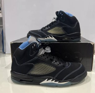
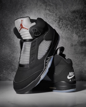
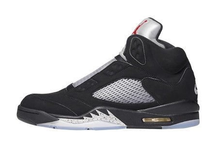
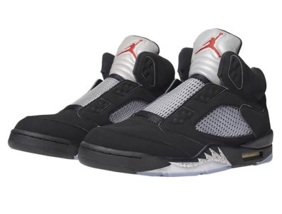
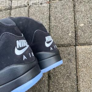
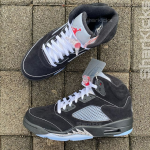
Does that mean I don't want to see the return of the OG smooth, matte grey 3M? No. I would love it if that style of 3M returned. It looks much better. However, it's been almost 10 years since 2016 and nothing has changed. Let's say, 2030 comes and for the 40th anniversary of the Air Jordan 5, we get a Black Metallic release that has all the bells and whistles. I'm talking contrast ankle that has that slightly oily/leather-like sheen to it, clear outsole, netting that doesn't yellow so quick, improved shape and cut, better quality nu-durabuck/synthetic nubuck that Nike uses now, all topped of with reprints of Nike's 1990 Fall Collection catalog and Newsletter. The only catch is that they still use the current 3M on the tongue. Would some of you still pass? I couldn't, personally.
Does that mean I don't want to see the return of the OG smooth, matte grey 3M? No. I would love it if that style of 3M returned. It looks much better. However, it's been almost 10 years since 2016 and nothing has changed. Let's say, 2030 comes and for the 40th anniversary of the Air Jordan 5, we get a Black Metallic release that has all the bells and whistles. I'm talking contrast ankle that has that slightly oily/leather-like sheen to it, clear outsole, netting that doesn't yellow so quick, improved shape and cut, better quality nu-durabuck/synthetic nubuck that Nike uses now, all topped of with reprints of Nike's 1990 Fall Collection catalog and Newsletter. The only catch is that they still use the current 3M on the tongue. Would some of you still pass? I couldn't, personally.