- Apr 23, 2015
- 8,799
- 10,386
I design logos and packaging
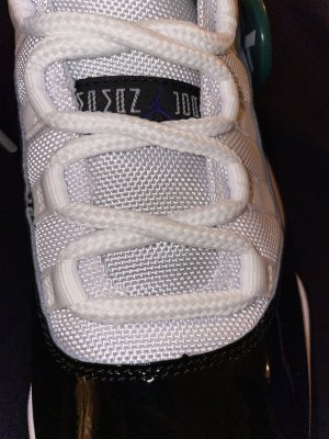
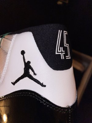
I look for balance and see negative space. When something doesnt look right its because they changed something that contradicts the original design. Ill see it right away. Tinkers designs rely heavily on use of negative space and what he does with it. You can tell his work gets to a point where it designs itself. He wouldnt leave such a loose end like that slippy dip collar on the win like 82s. I would bet anything that he also positioned the jumpman where he did and sized it how he did to correlate to the eyelets across from it as well as the hill crest in the patent below it.
I look for balance and see negative space. When something doesnt look right its because they changed something that contradicts the original design. Ill see it right away. Tinkers designs rely heavily on use of negative space and what he does with it. You can tell his work gets to a point where it designs itself. He wouldnt leave such a loose end like that slippy dip collar on the win like 82s. I would bet anything that he also positioned the jumpman where he did and sized it how he did to correlate to the eyelets across from it as well as the hill crest in the patent below it.
Last edited:

 I'm still in for a pair though.


 .
.

