Which Latest Retro has the closest resemblance to the OG?

1,507
725
Joined
Mar 15, 2007
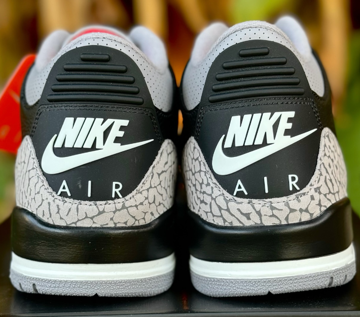
As we all know JB loves to tease us with OG colorways, but most if not ALL times they like to make minor changes to the Retro. Whether its a Nike swoosh on the back, 3M Materials on some 13's, Blue tint on some 11 soles, SB tongue on a pair of 1's or just overal quality of the shoe, JB loves to make these minor changes to retros from having it look completely like a OG pair.
My question is, Why do they do this? and  Which Latest Retro has the closest resemblance to the OG?
 
I don't think any current/future releases will come anywhere near the OG versions. OGs was back when JB actually cared about quality...
 
I think the white/cement IVs were pretty close colorway and packaging wise. The shape was ok I guess but not close to the OGs. Also no Nike Air.
 
Originally Posted by blacklion23

I think the white/cement IVs were pretty close colorway and packaging wise. The shape was ok I guess but not close to the OGs. Also no Nike Air.
Sorry man but they are not even close to the OG cement IV's in color.
I didn't realize it myself until I saw both side by side.
 
All the recent 11's are actually pretty close from strictly a looks standpoint. The Jumpman being flipped is the only major difference, and of course the shape on the CDP's/Space Jams were off. But overall they're some of the closest.

Aesthetically, the CDP 13's are identical to the OG's..

Hare 7's from the CDP were very, very close too.

The white Infrared 6's from the Infrared pack were damn close, only thing keeping them from being exact was the Jumpman vs Nike Air

No one mentioned the Playoff 12's?

Oh, and Banned 1's of course. Minus the X.

The reason they do it is to "protect" the OG collections and retain a sense of specialness.
 
Originally Posted by Weatherman

Hare 7's from the CDP were very, very close too.
I would say so.


Obviously none of them are the exact same.
 
Chicago X's?

I know the Jumpman was black and reversed and the sock liner was solid red.

Wait, never mind.
 
None but if someone asked me this question with a gun to my head demanding an answer I would have to say the Playoff XIII were the closest
ohwell.gif
 
Originally Posted by super23freak

Originally Posted by blacklion23

I think the white/cement IVs were pretty close colorway and packaging wise. The shape was ok I guess but not close to the OGs. Also no Nike Air.
Sorry man but they are not even close to the OG cement IV's in color.
I didn't realize it myself until I saw both side by side.
Yeah, the IV is the worst one of them all.  I mean *@*%, the netting alone throws the shoe off.  Combine that with the banana shape, lower cut, no Nike Air, Pleather, thin tongue, no padding and the IV has to be one of the worst examples of a retro ever.   Man, it ranks up there with the horrible dt max retro and the tech challenge retro a few years back.
But, IMO the Playoff 13 has to be one of the more perfectly executed retros past 2005.
 
I'm not even sure if the Playoff XIIIs qualify.

The outsole has red lines as opposed to gray lines on the OG.
 
You guys forgot the ajxiv last shots and white/reds.
both look almost identical to the ogs.
the 2011 last shots look even closer to the
Ogs than the 2004 retro.
 
Playoff XIIIs. The White/Red XIIIs, Carmine VIs, Hare VIIs, and Playoff VIIIs are up there too.
 
Back
Top Bottom