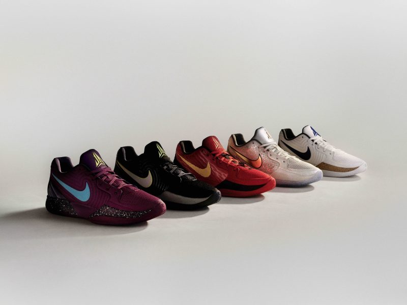
The rendering looks great!
I think the design is battling itself a bit. You have some great detailed elements (would be interested to hear more about how you reached the conclusions in your design) that are all struggling for attention. This makes it unclear what the message of your product is to the viewer. I think each shoe (espec in jordan which is typically a very clean aesthetic) should have a main hero with some complimentary discovery details. So you can pick ONE of these bold details (intriquit netting, TPU midsole inserts) and clean the rest off of the side and tighten up your pattern. Your topline is interesting, so keep that part. Then you can still use these other details you have developed by using them in other areas such as the heel and outsole to keep your shoe clean looking but rich in details and interesting to look once you take it off the wall for inspection. Just my thoughts.
Think about past Jordans for a second. The XVIII- super clean with that shiny TPU midsole. The XX- clean...with the focus on the strap. The XXI- clean with focus on the forefoot support piece and subtle malleolus molding. The XXII- clean with the focus on the camo print and shank which escapes away under the foot so you will be compelled to see where it goes and how it works. I can go on and on...but hopefully you are seeing the formula. I like what you have going on, but would challenge you to rework this and see where it takes you! Good work!
-TH
"So many times it happens too fast.
You trade your passion for glory.
Don't lose your grip on the dreams of the past.
You must fight just to keep them alive."


